Colour Drives 85% of Purchase Decisions
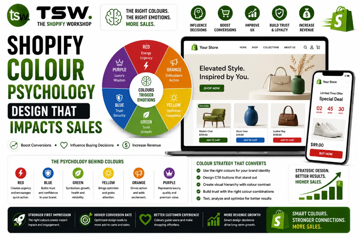
Research consistently shows that colour is a primary factor in product perception and purchase decisions. Within 90 seconds of viewing a product, consumers form subconscious judgments — and 62-90% of those judgments are based on colour alone. Our design team applies these principles systematically.
Colour Meanings in Ecommerce
Trust Colours
Blue conveys trust, security, and professionalism. It is the most popular colour in ecommerce, used by brands like PayPal, Samsung, and Dell. Ideal for technology, B2B, and financial products. Works well for trust badges and security indicators.
Action Colours
Red creates urgency and excitement. Use for sale badges, limited-time offers, and clearance sections. Orange is less aggressive but equally action-oriented — perfect for CTA buttons and promotional banners. Both drive impulsive purchases.
Premium Colours
Black communicates luxury, sophistication, and exclusivity. Gold and deep purple reinforce premium positioning. Use for high-end product pages, VIP sections, and luxury brand stores.
Natural Colours
Green represents health, sustainability, and growth. Perfect for organic products, eco-friendly brands, and wellness stores. Earth tones (browns, tans, olive) work for outdoor, natural, and artisanal brands.
Applying Colour to Your Shopify Store
Primary Brand Colour
Your primary colour should reflect your brand personality and resonate with your target audience. Use it consistently across the logo, headings, and key interactive elements. Limit it to 60% of visual real estate using the 60-30-10 rule.
CTA Button Colours
The add-to-cart and checkout buttons need maximum contrast against the page background. Test different colours — the best CTA colour is not universal but depends on your overall colour scheme. The key is visibility and contrast, not a specific hue.
Background and White Space
White or near-white backgrounds let products shine. Generous white space reduces cognitive load and makes the shopping experience feel premium. Dark backgrounds work for specific aesthetics but require careful typography and contrast management.
Colour Accessibility
Never rely on colour alone to convey information — use text labels, icons, and patterns alongside colour coding. Test colour combinations for contrast ratios meeting WCAG AA standards. Approximately 8% of men have colour vision deficiency — design for them.
Testing Colour Decisions
Use A/B testing to validate colour choices. Test CTA colours, promotional banner colours, and product page colour schemes. What feels right to your design team may not perform best with your actual audience. Let data decide.
Seasonal Colour Strategy
Align promotional colours with seasons and holidays — warm reds and golds for festive periods, pastels for spring, deep jewel tones for autumn. Seasonal colour updates keep your store feeling fresh and relevant throughout the year.
Need a colour strategy for your store? Consult our design team for data-driven design decisions.