Navigation Is Your Store’s Roadmap
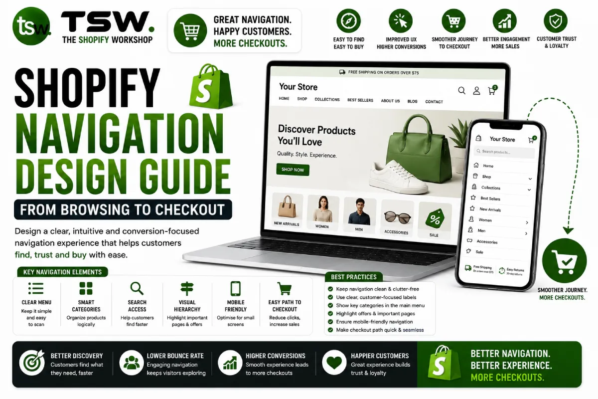
Poor navigation is the silent killer of ecommerce sales. If customers cannot find products within three clicks, they leave. Effective navigation balances comprehensive product access with simplicity and speed. Our theme designs prioritise intuitive navigation architecture.
Primary Navigation Patterns
Mega Menu
For stores with many categories, mega menus display the full navigation hierarchy in a single view. Include product images, featured collections, and promotional banners within the dropdown. Organise with clear headings and logical groupings.
Simple Dropdown
Stores with fewer categories benefit from clean dropdown menus. Each top-level item reveals a single column of sub-items on hover. This is faster to navigate and less overwhelming than mega menus for smaller catalogues.
Hybrid Approach
Use mega menus for product categories and simple dropdowns for informational pages (About, Blog, Contact). This balances product discoverability with information architecture.
Category Architecture
Breadth vs Depth
Favour breadth over depth — more top-level categories with fewer subcategories is easier to navigate than deeply nested hierarchies. Aim for a maximum depth of three levels. If you need more, your categorisation probably needs rethinking.
Customer-Centric Labels
Name categories using language your customers use, not internal product taxonomy. “Women’s Tops” beats “Category 4A.” Use your SEO keyword research to inform category naming — align navigation labels with search terms.
Cross-Category Navigation
Some products belong to multiple categories. Use Shopify collections and automated collection rules to let products appear in multiple navigation paths. A “Summer Dresses” collection might surface under both “Dresses” and “Summer Collection.”
Search as Navigation
Predictive Search
Implement instant search with product thumbnails, prices, and quick-add buttons. Show relevant collections and pages alongside product results. Auto-correct typos and suggest alternatives for no-result queries.
Search Prominence
Make search visible and accessible — not hidden behind an icon. Studies show that visitors who use search convert at 1.8x the rate of browsers. On mobile, search should be the primary navigation method.
Footer Navigation
The footer is a secondary navigation system for policies, company information, and customer service links. Include contact information, social media links, newsletter signup, and payment method icons. A well-structured footer catches users who scroll past the fold.
Mobile Navigation Best Practices
- Full-screen mobile menu with large, tappable links
- Collapsible sub-menus with smooth animations
- Prominent search bar within the mobile menu
- Cart and account icons always visible in the header
- Bottom navigation bar for primary actions
Testing Your Navigation
Use heatmaps and session recordings from tools like Hotjar or Lucky Orange to see how customers actually navigate. Look for dead-end pages, unused menu items, and common search queries that should be navigation items. Apply CRO methodologies to continuously improve.
Need a navigation redesign? Partner with our UX team for evidence-based improvements.