Mobile Commerce Dominates
Over 72% of ecommerce traffic now comes from mobile devices, yet mobile conversion rates lag behind desktop by 50-60%. This gap represents massive untapped revenue. Our custom themes are designed mobile-first to close this conversion gap.
Thumb Zone Design
Understanding Reach Zones
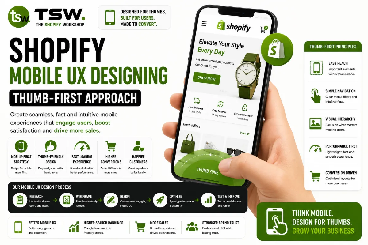
Most users hold their phone with one hand and navigate with their thumb. The comfortable reach zone is the lower-middle area of the screen. Place primary actions — add to cart, checkout, navigation — within this zone. Secondary content can occupy the top of the screen.
Touch Target Sizing
Touch targets must be at least 44×44 pixels with adequate spacing between them. Small, crowded links lead to misclicks and frustration. Filter chips, variant selectors, and navigation items all need generous tap areas.
Mobile Navigation Patterns
Bottom Navigation
Consider a bottom navigation bar for key actions — home, search, categories, cart, account. This keeps primary navigation in the thumb zone. Many top-performing mobile commerce apps use this pattern.
Search-First Approach
Mobile users often prefer search over browse. Make search prominent and implement predictive search with product thumbnails, auto-suggestions, and recent searches. A fast, accurate search can dramatically improve mobile conversions.
Simplified Menu
Reduce navigation depth on mobile. Flatten category hierarchies and surface popular categories directly. Use a hamburger menu but ensure it opens full-screen with large, tappable links.
Mobile Product Pages
Visual-First Layout
Lead with a full-width swipeable image gallery. Product images should be the dominant element, with title, price, and buy button immediately below. Detailed descriptions, reviews, and specifications go further down in collapsible sections.
Sticky Add to Cart
Keep the add-to-cart button visible as users scroll through product information. A sticky bar at the bottom with price and buy button ensures customers can always take action without scrolling back up.
Variant Selection
Use large, tappable colour swatches and size buttons instead of dropdown menus. Dropdowns require precise tapping and extra steps. Visual selectors are faster and reduce friction in the purchase flow.
Mobile Checkout Optimisation
Express Checkout
Surface Apple Pay, Google Pay, and Shop Pay buttons prominently. These one-tap payment methods bypass form filling entirely, dramatically reducing mobile checkout friction and abandonment.
Form Design
- Use appropriate input types (tel for phone, email for email) to trigger correct keyboards
- Auto-detect postcode and populate city/county automatically
- Single-column layout — never side-by-side fields on mobile
- Show progress clearly with step indicators
- Auto-advance to next field where possible
Performance on Mobile
Mobile users are often on slower connections. Target under 3 seconds for full load on 4G. Minimise data transfer with compressed images and deferred scripts. Our performance optimisation ensures fast mobile experiences on any network.
Ready to transform your mobile experience? Get a mobile UX audit from our design team.