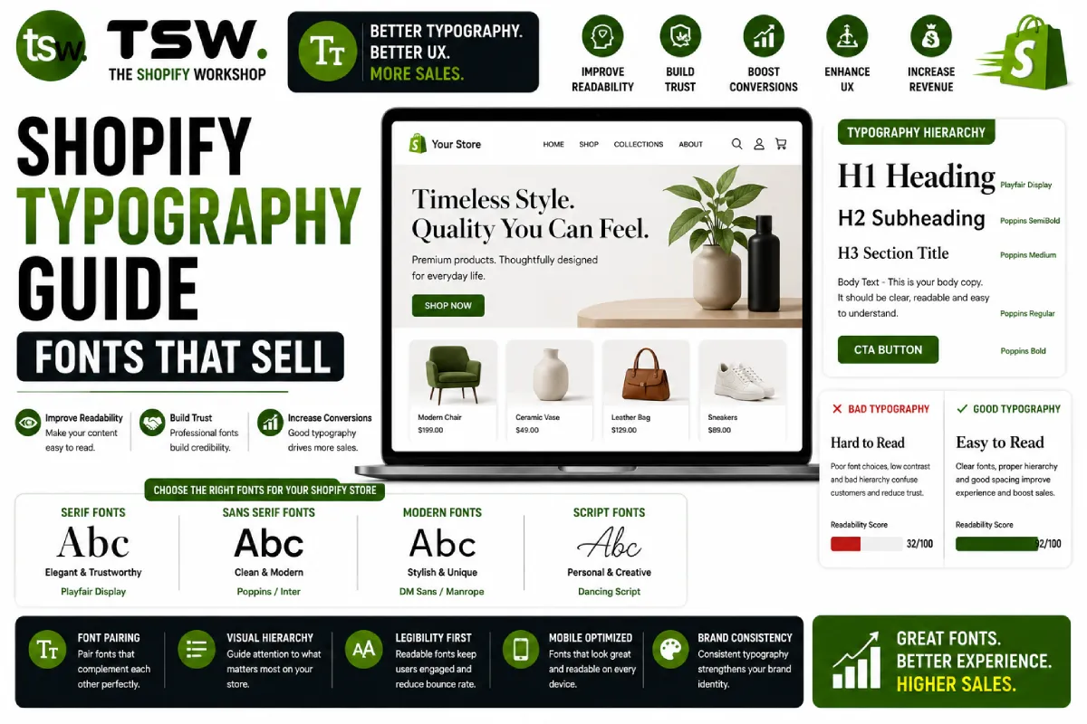
Typography Is the Foundation of Design
Typography accounts for 95% of web design — it is the primary vehicle for communicating with customers. The right fonts build trust, guide attention, and reinforce brand identity. The wrong fonts create friction and undermine credibility. Our theme development process gives typography the attention it deserves.
Font Selection Principles
Readability First
Body text must be effortlessly readable at 16px on mobile. Choose fonts with generous x-height, open counters, and clear letterform differentiation. Sans-serif fonts like Inter, DM Sans, and Source Sans Pro excel for ecommerce body copy.
Brand Alignment
Your font choices should match your brand personality. Luxury brands gravitate toward elegant serifs. Tech brands prefer clean geometric sans-serifs. Artisanal brands suit humanist typefaces with character. The font speaks before the words are read.
Two-Font Rule
Limit your store to two fonts: one for headings, one for body text. Use weight and size variations to create hierarchy within each font. More than two fonts create visual chaos and slow page loads.
Performance Implications
Web Font Loading
Each font file adds 20-100KB to page weight. Four weights of a Google Font can add 200-400KB. This directly impacts page speed and Core Web Vitals. Every font choice is a performance decision.
Font Loading Strategy
- Use
font-display: swapto show text immediately with fallback fonts - Preload critical font files with
link rel="preload" - Subset fonts to include only needed character ranges
- Self-host fonts rather than loading from Google Fonts for better caching control
- Use variable fonts when available — one file replaces multiple weight files
System Font Stack Alternative
For maximum performance, consider system fonts for body text: -apple-system, BlinkMacSystemFont, Segoe UI, Roboto. These load instantly because they are already installed. Reserve custom fonts for headings where brand expression matters most.
Typography Hierarchy
Heading Sizes
Establish a consistent type scale. A popular ecommerce scale: H1 (36-48px), H2 (28-32px), H3 (22-24px), body (16-18px), small (14px). Maintain 1.3-1.5x ratio between each level for visual harmony.
Line Height and Spacing
Body text needs 1.5-1.7 line height for comfortable reading. Headings can use tighter line height (1.1-1.3). Paragraph spacing should be 1em minimum. These details separate professional from amateur design.
Text Width
Optimal reading line length is 50-75 characters. Product descriptions and blog content should not span the full page width on desktop. Use max-width constraints on text containers for readability.
Responsive Typography
Use CSS clamp() for fluid typography that scales smoothly between breakpoints. Set minimum and maximum sizes to prevent text from becoming too small on mobile or too large on wide screens. Test at every common viewport width.
Ecommerce-Specific Considerations
- Price display: Use tabular figures (monospace numbers) for prices and quantities
- Button text: Clear, legible at small sizes, good contrast ratios
- Product titles: Must work at varying lengths without layout breaking
- Multilingual support: Ensure fonts cover required character sets for international stores
Need a typography refresh? Work with our design team on a typographic system that elevates your brand.