
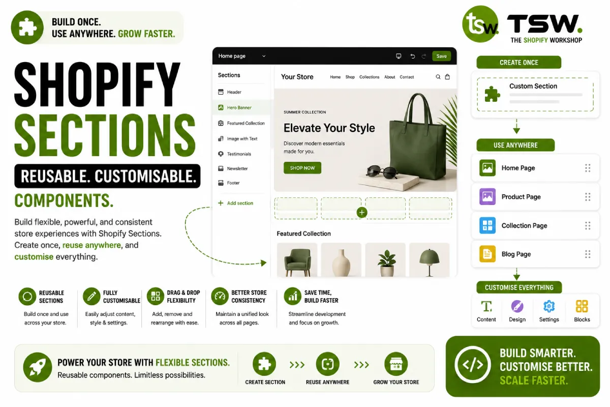
Sections Are the Building Blocks of Modern Shopify
In Online Store 2.0, sections are the fundamental unit of theme architecture. A well-designed section library enables merchants to build custom page layouts through the theme editor, reducing dependency on developers for content changes. Our custom themes feature extensive section libraries tailored to each client’s needs.
Anatomy of a Section
Template Structure
Every section has a Liquid template wrapped in a section tag. The template renders content using settings defined in the schema. CSS and JavaScript can be scoped to the section using the section ID for encapsulation.
Schema Definition
The schema JSON object defines the section’s name, tag, class, settings, blocks, and presets. Well-designed schemas make sections intuitive for merchants to configure without documentation.
Settings Design Patterns
Content Settings
Use rich text editors for formatted content, image pickers for visuals, and URL fields for links. Group related settings using header dividers and paragraph descriptions for guidance.
Layout and Style Settings
Offer colour scheme selectors, padding controls, and layout options (full-width vs contained). Use select dropdowns for predefined options rather than freeform inputs that might break the design.
Conditional Display
Implement checkbox settings for toggling section elements (show/hide testimonial counts, toggle animations, display section dividers). This gives merchants control without overwhelming them with options.
Block Patterns
Repeatable Blocks
Blocks handle repeating elements within a section — slides in a carousel, features in a grid, FAQs in an accordion. Define block types with their own schemas and limit maximum block counts appropriately.
Multi-Type Blocks
Sections can accept multiple block types. A hero section might accept heading blocks, text blocks, button blocks, and image blocks. This composability gives merchants maximum flexibility in content arrangement.
Responsive Implementation
Design sections mobile-first. Use CSS Grid and Flexbox for layouts. Provide column count settings that adapt across breakpoints. Test every section at mobile (375px), tablet (768px), and desktop (1200px+) widths.
Performance Considerations
- Lazy load images in sections below the fold
- Scope CSS to the section to prevent global stylesheet bloat
- Use
renderfor snippet includes within sections - Minimise Liquid loops and conditional complexity
- Defer JavaScript initialisation until the section enters the viewport
Testing Your Sections
Test with varying amounts of content — empty states, single items, maximum blocks. Verify the theme editor experience is smooth and settings produce expected visual changes. Check that sections work alongside other sections without style conflicts.
Need a custom section library? Work with our Shopify developers to build your perfect theme.